
Working with Rich Content Field

The Rich Content Field is a native Codex field that enables the creation and management of rich and structured content.
The Rich Content Field offers a default paragraph type and allows adding more types via the '/' symbol and drop-down menu search or browse. The available types are organized into categories such as textual, media, embeds, newsroom, etc., for easy searching. In addition, the drop-down menu displays the Most Used content types at the top for easy access. The Rich Content Field also allows adding other entries or references, enabling complex interconnected content creation. This field simplifies the creation and management of rich structured content in entries for editors.
The Rich Content Field's blocks have an editor toolbar with buttons for formatting text, aligning blocks, inserting links, creating tables, adding comments, and deleting the selected block. The available buttons depend on the block's content type. The following table lists the available content types in the Rich Content Field.
Content type | Type |
Paragraph | Textual |
Heading | Textual |
Bullet List | Textual |
Ordered List | Textual |
Factbox | Textual |
Blockquote | Textual |
Media | Media |
Facebook Embed | Embeds |
Youtube Embed | Embeds |
Instagram Embed | Embeds |
Twitter Embed | Embeds |
Spotify Embed | Embeds |
Fameplay Embed | Embeds |
Vimeo Embed | Embeds |
Apple Podcast | Embeds |
Google Podcast | Embeds |
TikTok Embed | Embeds |
Page Break | Newsroom |
Generic Iframe | Others |
Code Block | Others |
Table | Others |
Reference | Others |
Reference Inline | Others |
Html Box | Others |
Keep in mind that you can easily change or replace textual content types in your content. To do this, simply select the block of text that you want to modify and use the editor toolbar. The first button in the toolbar contains a dropdown menu that lets you switch to another content type with ease.
Paragraph
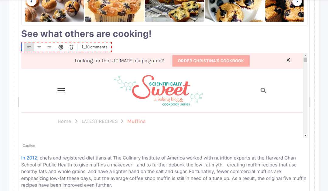
Paragraphs are used to present information in a structured and organized manner. The paragraph editor provides tools to format and organize text, accessed via the editor toolbar, including buttons for text formatting, alignment, inserting links, creating tables, adding comments, and deleting text blocks. These tools help ensure your paragraphs are clear, concise, and easily readable.
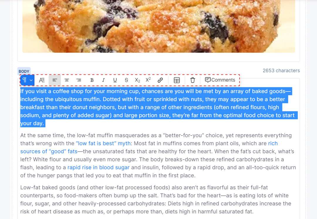
Paragraph preview and toolbar settings
The Drop cap button formats the first letter of the paragraph to be in a larger font size and capitalized, creating a draw attention to the first word of a new section or chapter.
The Left alignment button positions the paragraph text along the left margin, creating a clean and organized appearance.
The Center alignment button centers the paragraph text within the block, making it stand out and grab the reader's attention.
The Right alignment button aligns the paragraph text along the right margin, creating a visually appealing and symmetrical layout.
The Bold button makes the paragraph text bold and prominent, helping to emphasize important ideas and concepts.
The Italicize button adds emphasis to the paragraph text by slanting it to the right, making it stand out and draw the reader's attention.
The Underline button emphasizes the paragraph text by adding a line underneath it, highlighting key words and phrases.
The Strikethrough button crosses out the paragraph text, indicating that it is no longer relevant or accurate.
The Subscript button displays text below the baseline of the normal line of text, and the text is typically in a smaller font size than the surrounding text.
The Superscript button displays text above the baseline of the normal line of text, and the text is typically in a smaller font size than the surrounding text.
The Link button allows you to insert hyperlinks within the paragraph, making it easy for readers to access additional information or resources.
The Premium button highlights the selected text and makes it stand out from the rest, which can be used for various purposes on the frontend.
The Color Style option allows you to easily select a specific color to customize the text within your paragraph, adding emphasis and visual appeal to your content.
The Table button enables you to create a table within the paragraph, allowing you to present data and information in a clear and organized way.
The Delete button removes the entire paragraph block from the document, allowing you to easily remove unnecessary or redundant content.
The Comment button allows you to add notes and comments to the paragraph, providing feedback and suggestions for improvement.
The Clear Formatting button enables you to remove any formatting applied to the selected text, converting it to plain text.
At the end of the editor toolbar, the Characters section displays the number of characters in the selected text.
Heading
Headings are used to give structure to your content and make it easier to read. They can be used to create sections and subheadings, and are typically formatted with a larger font size and bold text. The Heading block in the Rich Content Field allows you to quickly add headings to your content and customize the format and alignment using the editor toolbar.
Heading preview and toolbar settings
The H1 button sets the default heading size.
The H2, H3, H4, H5, and H6 buttons allow you to adjust the heading size.
The left alignment, center alignment, and right alignment buttons allow you to adjust the alignment of the heading within the block.
The bold, italic, and underline buttons allow you to apply formatting to the heading text.
The strikethrough button allows you to strike through the text.
The subscript and superscript buttons allow you to display text below or above the baseline in a smaller font size.
The link button allows you to insert a link within the heading.
The premium button allows you to mark the heading as premium text.
The color style option allows you to easily select a specific color to customize the text within your heading.
The delete button allows you to remove the heading block.
The comment button allows you to add comments to the heading.
Bullet List
A Bullet List is an element that presents items in an organized, bulleted format. The items can include text, images, tables, links, and more. The editor toolbar for a bullet list offers options for text formatting, inserting links, adding comments, and deleting the whole block.
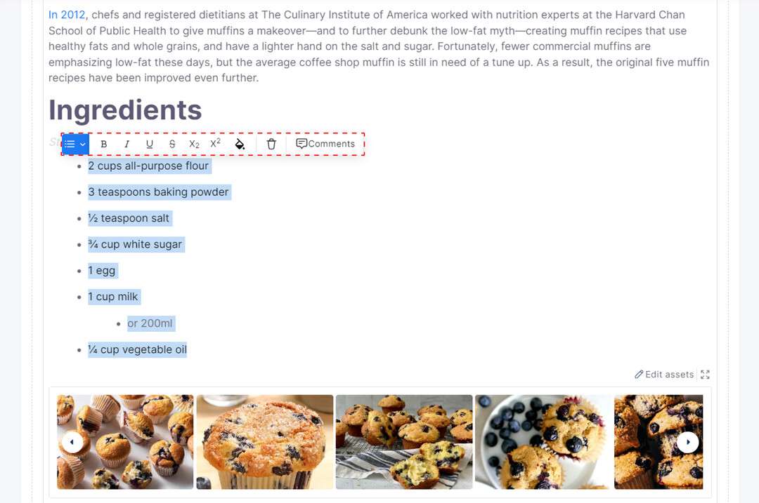
Bullet List preview and toolbar settings
Ordered List
An Ordered List is similar to a Bullet List, with the exception that items in the list are numbered. The order of items in an Ordered List is important, and you can add text, images, tables, links, and other content types as list items. The editor toolbar for an Ordered List contains buttons for formatting text, inserting links, adding comments, and deleting the entire block.
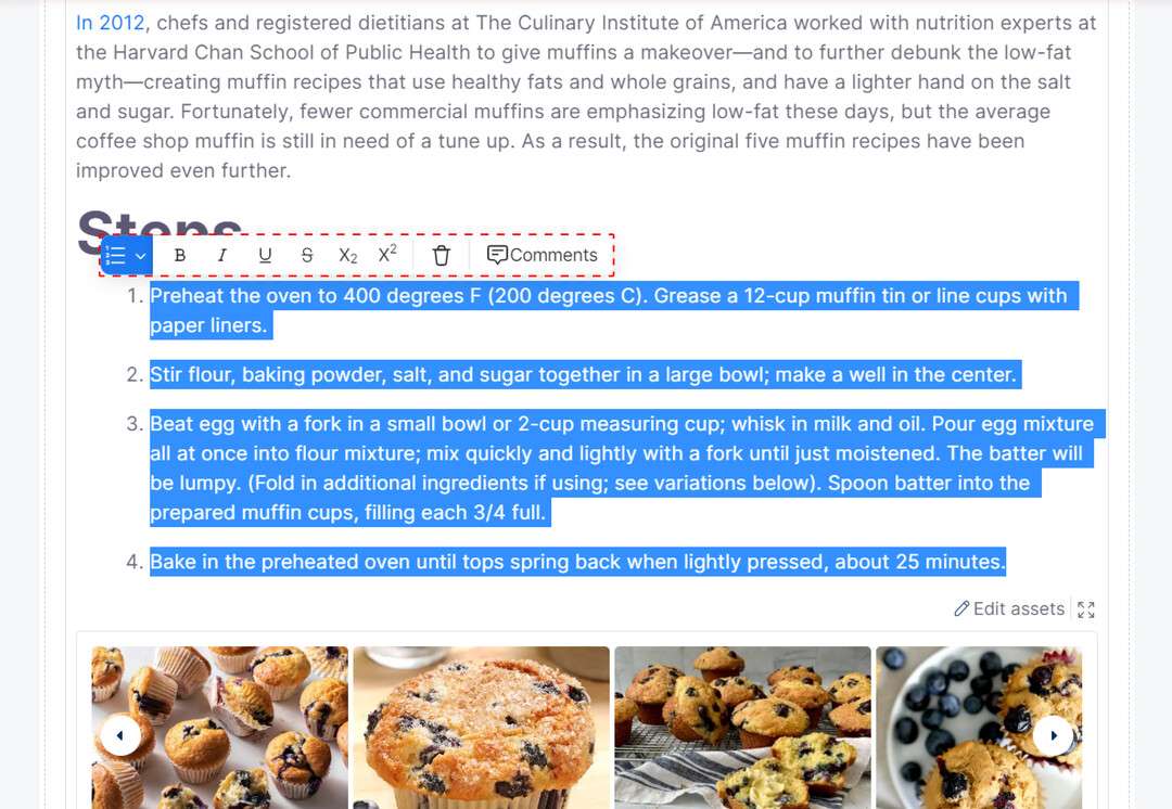
Ordered List preview and toolbar settings
Factbox
A Factbox is a content block that allows you to highlight important information in your content. You can add text or other content types, like headings, lists, links, and tables, to the Factbox and format the text within it. The Factbox editor toolbar provides options for text formatting, adding links, adding comments, and deleting the Factbox.
Factbox preview and toolbar settings
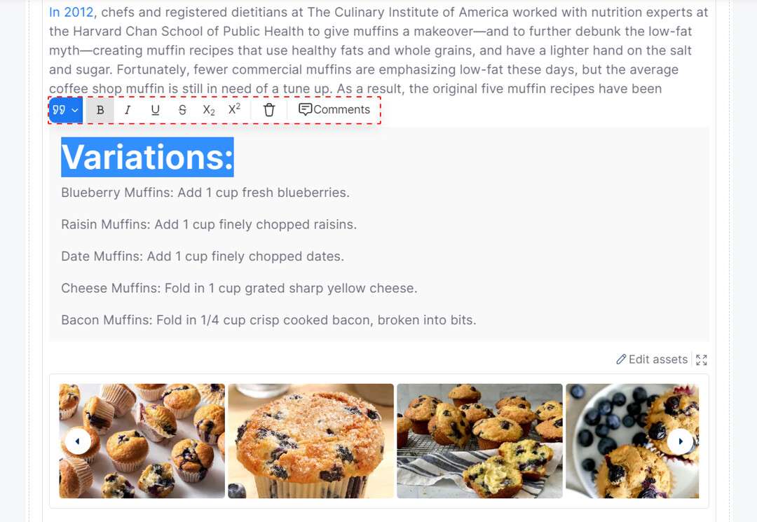
Blockquote
A Blockquote is a content element that displays a lengthy quote or a section that is sourced from another place. The editor toolbar for the Blockquote includes buttons for formatting text, adding links, adding comments, and deleting the entire block.
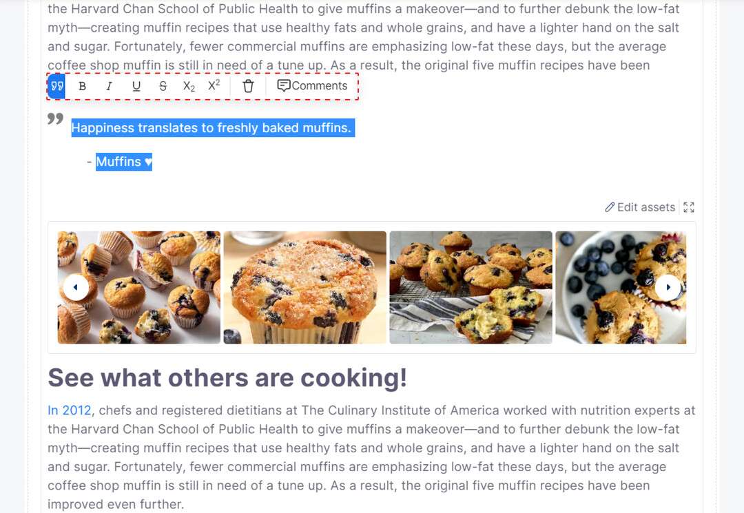
Blockquote preview and toolbar settings
Media
The Media content type in Codex provides the ability to insert and manage various digital assets, such as images, videos, files, and audios within your content. This can help make your content more visually appealing and engaging for your audience.
To add a media element to your content:
Type the forward slash symbol (/) in a new block.
Select the "Media" option from the drop-down menu, or start typing keywords such as "media", "image", "video", "file", and "audio", and then select the desired option.
The Assets modal will appear, displaying all your digital assets.
Select one or more media assets that you want to add to your content.
Click the "Ok" button on the bottom left of the Assets modal to insert the selected assets into your content.
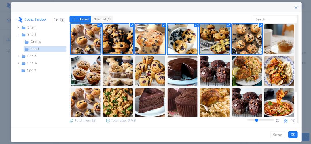
Adding Images from Assets inside Rich Content Field
Learn more on how to work with asses here.
When you add media files to your Rich Content field, you'll see three buttons at the top-right of the media block:
The "Edit Assets" button opens the Asset Management Hub, where you can edit your assets.
The "Show Details" button lets you view the details of each asset, including caption, creation date, source, author, and tags.
The "Expand" button lets you view all your items and reorder them as desired. Note that the "Expand" button only appears when you add more than six assets to your media block.
Embeds
Embeds are components that enable you to embed posts, videos, images, gifs, and other links from various websites or platforms into your content. Codex has a range of ready-to-use embeds such as Facebook, Instagram, YouTube, Twitter, Fameplay, Spotify, Vimeo, TikTok, Google Podcast, and Apple Podcast.
To add an embed to your content:
Type the forward slash symbol (/) in your content.
Select any of the available embed options from the drop-down menu, or start typing the keyword "embed" and then select the desired option.
A pop-up window will be shown where you can enter the URL of the embed that you want to add.
Once you have entered the URL, click the "Confirm" button.
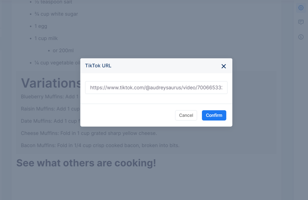
Embed URL Pop-up
An example of a TikTok embed appearing in your content is demonstrated below. You have the option of adding a caption, or utilizing the editor toolbar to align the embed, insert comments, or remove the entire block.
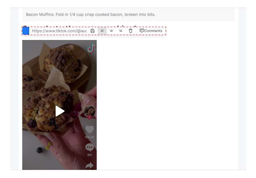
TikTok Embed preview and toolbar settings
Another method of embedding external content in the Rich Content field is by copying the URL and pasting it into a new block, which will then give you a dropdown menu with three options: Embed, Link, or Dismiss. Select Embed to display the content within your page.
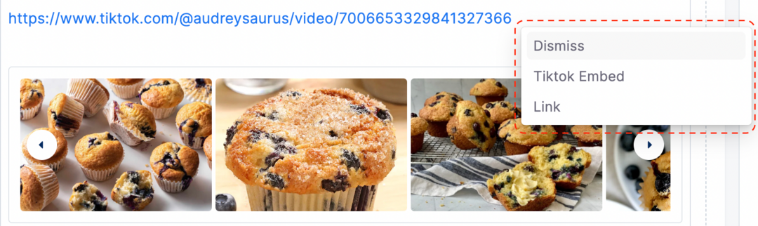
Embedding pasted URLs
Page Break
A Page Break is a tool that splits up a page into different parts and allows you to specify a label for each part. It has a field to input a section name for identification or description. The editor toolbar for a Page Break includes a field for adding an alias and buttons for commenting and deleting the entire block. An alias is a different name that can be given to the Page Break content.
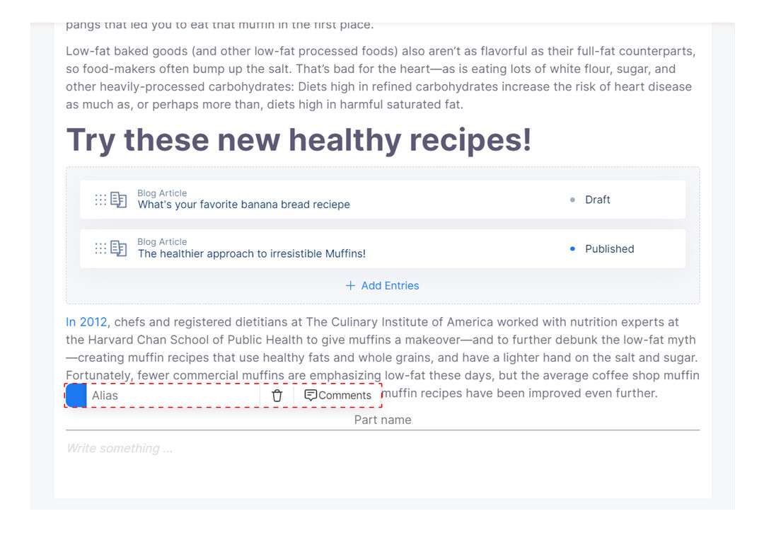
Page Break preview and toolbar settings
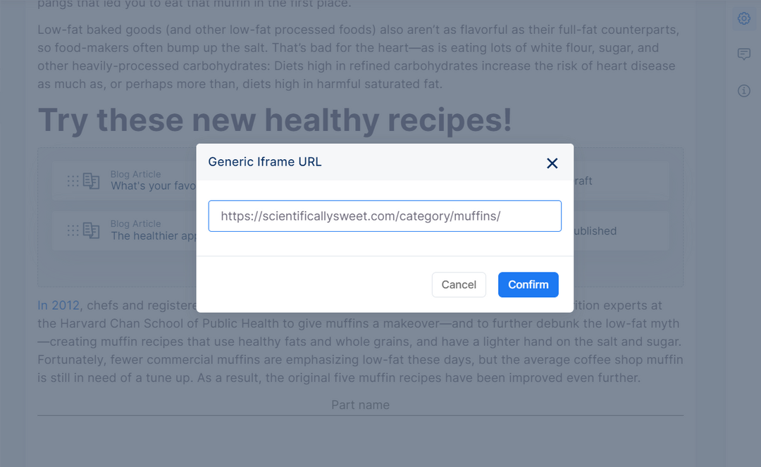
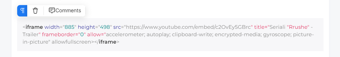
Generic Iframe
A Generic Iframe is a content element that allows you to integrate links or pages from external websites into your content. To add a generic iframe to your content:
Type the forward slash symbol (/) in your content.
Select the "Generic Iframe" option from the drop-down menu, or start typing the keyword "generic iframe" and then select the option.
A pop-up window will be shown where you can enter the URL of the external website that you want to add.
Once you have entered the URL, click the "Confirm" button.
Generic Iframe URL Pop-up
The editor toolbar for the Generic Iframe includes buttons for aligning the iframe, adding comments, deleting the entire block. Additionally, you have the option to add a caption to the iframe.
Generic Iframe preview and toolbar settings.
Code Block
The Code Block is a versatile content element that enables you to insert code snippets into your content. The code is displayed in a clear, readable format that makes it easy to comprehend. Additionally, you have the ability to manage the Code Block in the same way as any other content block. You can add comments or remove the block entirely by clicking on the bin icon.
Code Block preview and toolbar settings
Table
You can use a Table content element to add data in rows and columns with a lot of flexibility. Depending on your content, you can add text, images, links, and other types of content inside the table. The editor toolbar for a table includes options for formatting the table, as well as inserting, merging and deleting rows and columns.
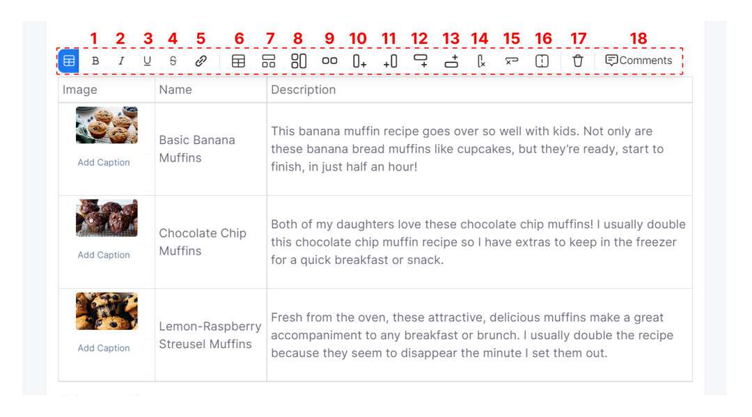
Table preview and toolbar settings
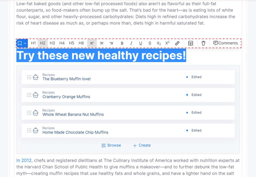
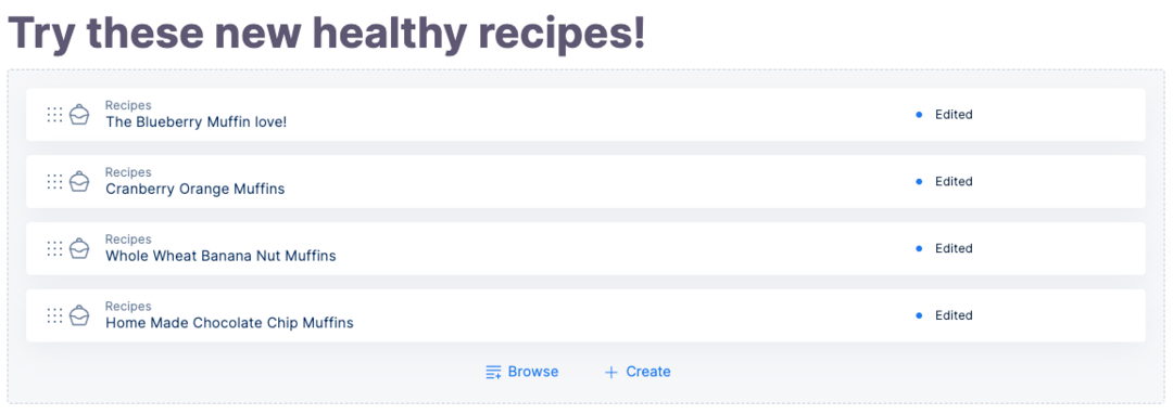
Reference
The Reference content type provides a convenient way to connect content entries. By using references, you can reuse existing content or establish logical relationships between entries without having to repeat or rewrite the information. For instance, a Food Blog can reference multiple Recipes, and the Recipes can reference multiple Ingredients within their content, offering a flexible and interconnected structure.
Changes made to a referenced entry will update everywhere it's used - so, if you change an ingredient in a recipe, it will be reflected on every individual page where you've used that recipe.
To add a reference to your Rich Content field, type the forward slash symbol (/), search and select "Reference" from the drop-down, browse entries via search and filter, select the desired entries, and click "Insert" in the modal. You can add entries from the same site and also from other sites within the organization.
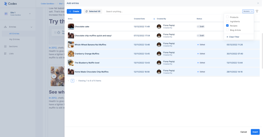
Browsing entries for Reference
Referenced Entries preview and toolbar settings
Another way to add references in the Rich Content field is by typing the "@" character and then searching for the desired entry. This is particularly quick and effective if you know exactly what you're searching for.
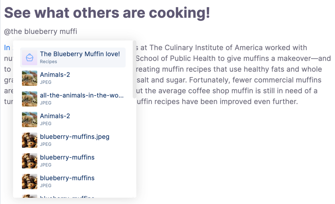
Quick search of entries and assets to reference in your entry