
Text Field

The Text Field represents a field that can be created in Model Builder, allowing the inclusion of text-based data values in Entries.
Text Field can be used for a variety of purposes, such as adding a Title to a blog article on your site, creating a dropdown menu, and more. The following section explains the configuration of the Text field in the model builder and its usage in an entry, depending on these configurations.
Text Field in Model Builder
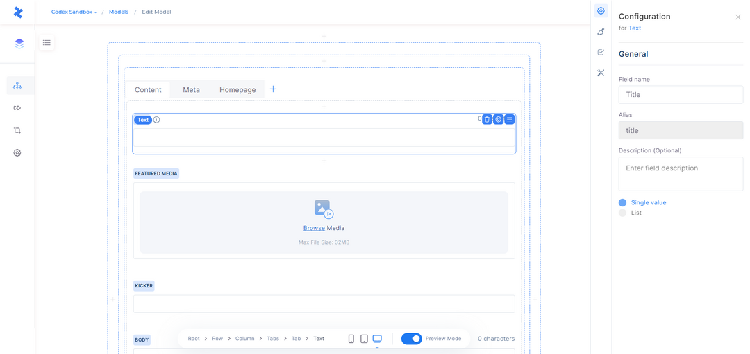
When adding a Text field in the model builder, you can configure its settings in the right sidebar. The field information that needs to be filled in includes:
Field name: This is the name of the field that will be displayed in entries and other relevant areas.
Alias: A required and unique identifier for the field, which cannot be modified once the field is saved.
Description: An optional field that allows you to describe the purpose or use case of the Text field.
Display: Determines how the field will be shown in entries and the value it can accept. You can select between Single (a single text value) or List (multiple text values). This choice cannot be altered after saving the field.
Once you have filled in the necessary field information in the configuration sidebar, you can click the "Create" button at the bottom, and the Text field will be successfully added to the model editor.
Text Field in Model Builder
Text Field Configuration
By selecting the Text field in the model editor, you have access to several quick actions. These actions enable you to delete the field, open the configuration sidebar, and adjust the field's position within the model.
The Configuration sidebar consists of four tabs: General, Appearance, Validations, and other Configuration. These tabs provide various settings and options for customizing the behavior and appearance of the Text field.
General tab
The General tab in the configuration of the Text field contains essential field information, including Field name, Alias, Description, and Display settings.
Note that while Field name and Description can be modified even after saving the field, the Alias and Display settings cannot be modified once the field has been saved in the model builder. These settings are fixed and cannot be changed once the field is created.
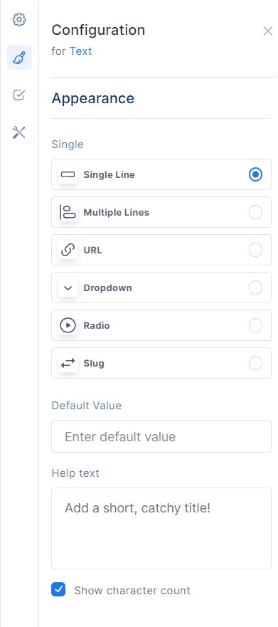
Appearance tab
The Appearance tab in the configuration of the Text field focuses on how the field will be displayed in the entries created by the model. The available options in the Appearance tab depend on the selected Display type of the Text field (Single or List).
If the Display type is set to Single, the following options can be chosen:
Single Line: This option allows for text to be added in a single line only. It can have a default value, which can be set in the "Default value" field. The default value will be shown in each entry as a default placeholder.
Multiple Lines: This option allows for text to be added in multiple lines. It can have a default value, which can be set in the "Default value" field. The default value will be shown in each entry as a default placeholder.
URL: This option enables the addition of URLs or links to the field. It can have a default value, which can be set in the "Default value" field. The default value will be shown in each entry as a default placeholder.
Dropdown: This option provides a predefined list of options, and users can select a single value from the dropdown menu. You can define the available options by specifying the "Predefined values" in the corresponding field. To add predefined values, click the "+Add" option on the right side of the field.
Radio: This option provides a predefined list of options, and users can select a single value using radio buttons. You can define the available options by specifying the "Predefined values" in the corresponding field. To add predefined values, click the "+Add" option on the right side of the field.
Slug: This option allows the creation of a simplified version of a word or phrase to be used as part of a URL. If you set a default value for a slug field, it will prevent the automatic generation of the slug from other entry fields.
If the Display type is set to List, the following options can be chosen:
Single Line: Similar to the Single display option, this allows for text to be added in a single line only. It can have default values, which can be set in the "Default value" field. The default values will be shown in each entry as a default placeholder.
Multiple Lines: This option allows for text to be added in multiple lines. It can have default values, which can be set in the "Default value" field. The default values will be shown in each entry as a default placeholder.
Tag: This option enables the insertion of separated values. You can define the available options by specifying the "Predefined values" in the corresponding field. To add predefined values, click the "+Add" option on the right side of the field.
List: This option enables the insertion of comma-separated values. You can define the available options by specifying the "Predefined values" in the corresponding field. To add predefined values, click the "+Add" option on the right side of the field.
Checkbox: This option provides a predefined list of options, and users can select multiple values using checkboxes. You can define the available options by specifying the "Predefined values" in the corresponding field. To add predefined values, click the "+Add" option on the right side of the field.
In addition to these Appearance options, the tab also includes the Help Text field. This field can be used to display a tooltip or inline text in the entry based on the selection, providing users with additional guidance and understanding of how to use the text field effectively.
Furthermore, the Appearance tab offers the option to show character counting in the entry. When enabled, this option will display the number of characters in the Text field, allowing users to keep track of the text length as they type or edit content. This option is only available for the Single display of the Text field, and when the appearance options are set to Single Line or Multiple Lines.
Appearance Tab
Validations tab
In the Validations tab, you have the ability to apply constraints to the Text field. These constraints enforce specific requirements on the field's input, ensuring that the entry cannot be published unless the Text field adheres to these restrictions. The available options for validation include:
Required field: If you select this option, the Text field must be filled when creating an entry. It becomes mandatory to input a value in the Text field before the entry can be published.
In addition to this option, you can enable a condition that makes this field required depending on the value of another text field. After enabling this option, you can continue to fill in the fields as follows:
Field: Opens a dropdown menu listing all the text fields of the current model.
Operator: Opens a dropdown menu with operators such as contains, does not contain, equals, does not equal, exists, and does not exist.
Value: Enter the desired value.
Read-only: This option allows you to make the field read-only for users.
Additionally, you can set a condition that makes this field read-only depending on the value of another field. After enabling this option, you can continue to fill in the fields as follows:
Field: Opens a dropdown menu listing all the text fields of the current model.
Operator: Opens a dropdown menu with operators such as contains, does not contain, equals, does not equal, exists, and does not exist.
Value: Enter the desired value.
Unique field: Enabling this option ensures that the input value of the Text field is unique for each entry. It prevents duplicate values from being used in different entries.
Limit character count: This option allows you to limit character count of characters that users can input into the Text field. Users will only be able to enter characters within this specified range. The available options are:
Between: With this option, you can set both a minimum and a maximum value, limiting users to input characters that fall between these two values.
At least: This option sets a minimum value, and users must input characters that are equal to or exceed the specified minimum.
At most: This option sets a maximum value, and users must input characters that are equal to or below the specified maximum.
Exactly: With this option, you can set an exact character count range, and users will be restricted to input characters within this defined range.
Accept only a specified number of list inputs
Match a specific pattern
Prohibit a specific pattern
By leveraging the Validations tab, you can ensure that the Text field in your model enforces specific constraints, maintaining data integrity and consistency in your entries.
Validations Tab
Other Configuration
This tab includes additional configuration options for the Text field, such as:
Enable field in search: When enabled, this option allows the selected text field to be searchable in the entries listing for the corresponding model.
Enable field in filter: When enabled, this option allows the selected text field to be available for filtering in the entries listing for the corresponding model.
Enable AI Content Generator: When enabled, this option adds the AI generator icon to the text field, allowing users to use the AI content generator within the text field.
Text Field in Entry Editor
The Text field in the entry will be displayed and can be used based on the configuration in the model. Let's explore some appearances and use cases of the Text field in the entry editor.
Single value: If the Display type is set to "Single" in the model, the user can only add a single value in the entry editor.
List value: If the Display type is set to "List" in the model, the user can add more than one value in the entry editor.
Single Line: If the Appearance option is selected as "Single Line" in the model, the user can only add text in a single-line field in the entry editor.
Multiple Lines: If the Appearance option is selected as "Multiple Lines" in the model, the user can add text in multiple lines in the field in the entry editor.
URL: If the Appearance option is selected as "URL" in the model, the user can only add a URL in the field in the entry editor. Otherwise, a warning message will appear under the respective field.
Tag: If the Appearance option is selected as "Tag" in the model, the user can only add tags in the field in the entry editor. After entering a tag, the user should click the “Add” button.
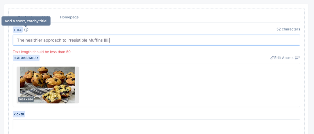
Show character count: If this option is enabled in the model, the number of characters will be displayed at the top of the Text field in the entry editor. This option is only available for the Single display of the Text field when the appearance options are set to Single Line or Multiple Lines.
Help Text Tooltip: If help text is added to the text field in the model's configuration and its display is set to "Tooltip", it will be displayed as a tooltip near the field's title in the entry editor, providing additional guidance.
Help Text Inline: If help text is added to the text field in the model's configuration and its display is set to "Inline text", it will be displayed as inline text near the field's title in the entry editor, providing additional guidance.
Required field: If the Text field is marked as a required field in the model, the user cannot publish the entry without filling in the respective field. A warning message with a red color will be displayed under the field, indicating that the Text field is required.
Read-only: If the Read-only option is enabled in the model, the user can view this field as read-only.
Unique field: If the Text field is specified as a unique field in the model, the user cannot publish the entry if the value entered already exists in another entry. An error message will appear on the left side of the entry editor, indicating that the field value is not unique in the collection.
Limit character count: If a specific character limit is defined for the Text field in the model, the user cannot publish the entry if the entered value does not fall within the specified limit. A warning error with a red color will be displayed under the field, depending on the template configuration in the model.
Text Field in Entry Editor
AI Content Generator: When enabled, this option will be displayed as an AI generator icon next to the text field. By clicking on this icon, a modal will appear below the text field, where the user can use the Autogenerate button to display at least three AI-generated suggestions for the text field based on the entry's content. After choosing one of these suggestions, the text will be added to the text field. Note that if there isn't any content in other fields, a message will appear indicating that content failed to load. Besides the autogeneration function, there is a custom field for the user to write a custom prompt for the AI to generate content.