
Boolean Field

The Boolean Field represents a field that can be created in Model Builder, allowing the inclusion of a "true" or "false" value in entries.
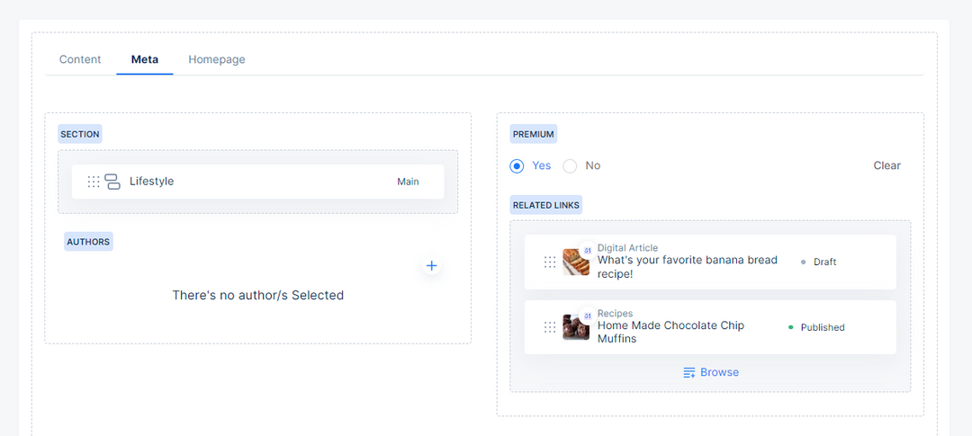
For instance, you can use the Boolean field to represent the premium status of a blog article in your site. The following section explains the configuration of the Boolean field in the model builder and its usage in an entry, depending on these configurations.
Boolean Field in Model Builder
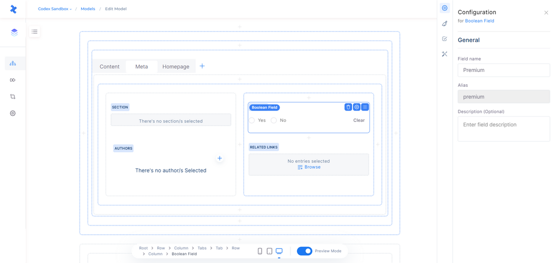
When adding a Boolean field in the model builder, you can configure its settings in the right sidebar. The field information that needs to be filled in includes:
Field name: This is the name of the field that will be displayed in entries and other relevant areas.
Alias: A required and unique identifier for the field, which cannot be modified once the field is saved.
Description: An optional field that allows you to describe the purpose or use case of the Boolean field.
Once you have filled in the necessary field information in the configuration sidebar, you can click the "Create" button at the bottom, and the Boolean field will be successfully added to the model editor.
Boolean Field in Model Builder
Boolean Field Configuration
By selecting the Boolean field in the model editor, you have access to several quick actions. These actions enable you to delete the field, open the configuration sidebar, and adjust the field's position within the model.
The Configuration sidebar consists of four tabs: General, Appearance, Validations, and other Configuration. These tabs provide various settings and options for customizing the behavior and appearance of the Boolean field.
General tab
The General tab in the configuration of the Boolean field contains essential field information, including Field name, Alias, and Description.
Note that while Field name and Description can be modified even after saving the field, the Alias cannot be modified once the field has been saved in the model builder.
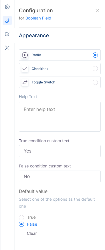
Appearance tab
The Appearance tab in the configuration of the Boolean field focuses on how the field will be displayed in the entries created by the model. The available options in the Appearance tab are as follows:
Radio: This option provides two conditions: True condition and False condition, which are displayed below the appearance options. By default, the True condition has a custom text "Yes," and the False condition has a custom text "No," which you can modify according to your needs. Besides these, it can have a default value of "True" or "False," and you can also remove the default value by selecting the Clear button.
Checkbox: This option provides a single condition: True condition, which is displayed below the appearance options. By default, this condition has a custom text "Yes," which you can modify according to your needs.
Toggle Switch: This option provides a single condition: True condition, which is displayed below the appearance options. By default, this condition has a custom text "Yes," which you can modify according to your needs.
In addition to these Appearance options, the tab also includes the Help Text field. This field can be used to display a tooltip or inline text in the entry based on the selection, providing users with additional guidance and understanding of how to use the text field effectively.
Appearance Tab
Validations tab
In the Validations tab, you have the ability to apply constraints to the Boolean field. These constraints enforce specific requirements on the field's input, ensuring that the entry cannot be published unless the Boolean field adheres to these restrictions. The available options for validation include:
Required field: If you select this option, the Boolean field must be filled when creating an entry. It becomes mandatory to input a value in the Boolean field before the entry can be published.
In addition to this option, you can enable a condition that makes this field required depending on the value of another text field. After enabling this option, you can continue to fill in the fields as follows:
Field: Opens a dropdown menu listing all the text fields of the current model.
Operator: Opens a dropdown menu with operators such as contains, does not contain, equals, does not equal, exists, and does not exist.
Value: Enter the desired value.
Read-only: This option allows you to make the field read-only for users.
Additionally, you can set a condition that makes this field read-only depending on the value of another field. After enabling this option, you can continue to fill in the fields as follows:
Field: Opens a dropdown menu listing all the text fields of the current model.
Operator: Opens a dropdown menu with operators such as contains, does not contain, equals, does not equal, exists, and does not exist.
Value: Enter the desired value.
Note that the validation for the Required Field is only available for the Radio appearance option. For Checkbox and Toggle Switch, there are no validations to be selected.
By leveraging the Validations tab, you can ensure that the Boolean field in your model enforces specific constraints, maintaining data integrity and consistency in your entries.
Other Configuration
This tab includes additional configuration options for the Boolean field, such as:
Enable field in filter: When enabled, this option allows the selected Boolean field to be available for filtering in the entries listing for the corresponding model.
Boolean Field in Entry Editor
The Boolean field in the entry will be displayed and can be used based on the configuration in the model. Let's explore some appearances and use cases of the Rich Text field in the entry editor.
Radio buttons: When the Appearance option is set to "Radio" in the model, the user will encounter two radio buttons in the entry. These buttons will have two custom text values assigned to them. One button will represent the True value, and the other will correspond to the False value.
Checkboxes: If the Appearance option is chosen as "Checkbox" in the model, the user will be presented with a single checkbox. The checkbox will have a default value (either True or False) based on the model's configuration. To select the desired value, the user can either check or uncheck the box.
Switch toggle: When the Appearance option is set as "Switch Toggle" in the model, the user will be presented with a switch toggle. This switch toggle will have a default value (either True or False) based on the model's configuration. To select the desired value, the user can simply toggle the switch on or off.
Help Text Tooltip: If help text is added to the Boolean field in the model's configuration and its display is set to "Tooltip", it will be displayed as a tooltip near the field's title in the entry editor, providing additional guidance.
Help Text Inline: If help text is added to the Boolean field in the model's configuration and its display is set to "Inline text", it will be displayed as inline text near the field's title in the entry editor, providing additional guidance.
Required field: If the Boolean field is marked as a required field in the model, the user cannot publish the entry without filling in the respective field. A warning message with a red color will be displayed under the field, indicating that the Boolean field is required.
Read-only: If the Read-only option is enabled in the model, the user can view this field as read-only.
Boolean Field in Entry Editor