
Adding Fields in Model Editor

The Content Model builder is a tool that helps create and manage the structure of content in Codex.
The Model Editor is the environment in which you can create the framework for the entries that editors will use to create the content. A content model builder simplifies the process of creating and managing a content model by providing an intuitive interface for defining content types and relationships. This is done by adding columns, rows, and fields with specific data types to the model, allowing for a custom structure that is tailored to the needs of each model.
On the right Side Panel, you will find a list of all the fields that can be added to the model by simply dragging and dropping them into the desired row or column. Each field in the Model Editor also has a set of quick actions, such as the ability to delete the field, access the configuration tab, and rearrange the field's position within the model.
Field Configuration Tab
Fields can be configured on the right Side Panel, which provides access to the settings that are common to all field types. These settings include General field information, Appearance options, and Validations that can be applied to the selected field.
The General tab contains basic information about the selected field, such as the Field name, Alias name, and Description. This information is applicable to all field types, and is intended to provide users with a clear understanding of the purpose and characteristics of the field. In some cases, there may also be a toggle for enabling the calculation of metrics for the field, which allows users to track and analyze the data entered into the field.
The Field name is used to identify and label the field within the model. It is displayed to users as the field's title, and can be modified at any time to reflect changes in the field's purpose or use.
The Alias is a unique identifier for the field that is used in the underlying code as a JSON property. It is important to carefully choose a unique and descriptive Alias for each field, as it cannot be changed once it has been set. The Alias serves as a reference for the field, allowing the system to access and manipulate the field's data as needed.
The Description is an optional field that allows users to provide a more detailed explanation of the field's purpose and characteristics.
The Appearance tab allows users to customize the way in which the selected field is displayed within the entry editor. Users can also specify a default value for each appearance option and a help text, providing editors with additional guidance and context for using the field when creating entries.
The Validations tab allows users to add constraints to the selected field, ensuring that the data entered into the field is accurate and conforms to the desired standards. This includes options such as defining the field as Required, Unique, or setting a character count limit. For each validation option, users can also specify an error message that will be displayed to editors if the field is not filled out as required. These features help prevent errors and inconsistencies in the data entered into the field, improving the overall accuracy and reliability of the model's content.
Number Field
The Number field is used to add numeric values to an entry. For example, you can use the Number field to display the reading time for a blog article on your site. When clicking on the Number Field, you can use the quick actions to delete the field, open the configuration tab, and change its position within the model.
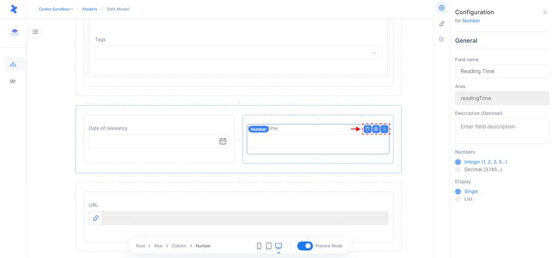
Number Field and Configuration Tab.
Customize Number Field
When adding a Number field to the model editor, you can specify the number type (integer or decimal) and the display format (single value or list) in addition to the General field information.
In the Appearance tab, you can choose how the Number field will appear within the entry editor. If it is defined as a single value field, you can select its appearance as a number input, dropdown, radio, or rating. If it is defined as a list field, you can select its appearance as a number input, checkbox, or dropdown.
The "number input" field allows users to enter numeric values.
The "dropdown" and "radio" options provide users with a list of predefined choices from which they can select a single value or item.
The "rating" option enables users to rate content using a system of one to five stars. These ratings can be used to provide feedback or assess the quality of the content.
In the Validations tab, you can add constraints to the Number field. You can mark the field as required, which means that the Number field must be filled when creating an entry. You can also make the input value unique for each entry by selecting the Unique field option. Additionally, you can specify a number range to limit the values that editors can add to the Number field. This range can be defined as "between" (two numbers), "at least" (a number), or "more than" (a number). These options allow you to ensure that the values entered in the Number field meet your desired criteria and adhere to any necessary limitations.
Media Content
The Media Content field is used for adding media files, such as images, videos, and documents, to your content. This field enables editors to enhance their content by inserting relevant media files within their article. To manage this field, a few quick actions are available, including the ability to delete the field, open the configuration tab, and change its position within the model.
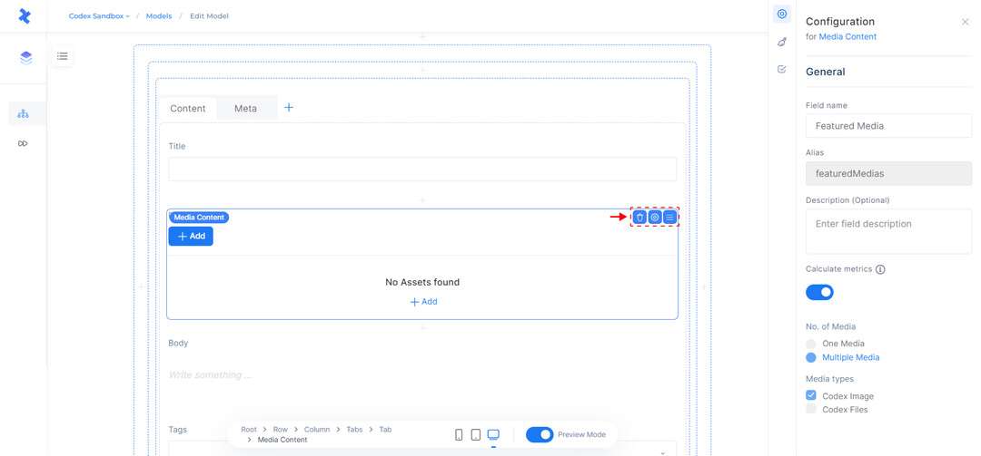
Media Content and Configuration Tab.
Customize Media Content
To create a Media Content field in the model editor, it is necessary to specify the relevant General field information as well as the maximum number of media items that can be added to the field. This quantity can consist of either a singular or multiple media items, and editors can also opt to enable the option to calculate metrics for the field. Furthermore, editors can select from a range of media types, including Images, Files, Videos, and Playlists, that can be added to this field.
Importantly, it is possible to modify the selected media types even after the model has been published.
In the Appearance tab, you can specify how the field will be displayed. If the field allows multiple media items, you can choose to display it as a Media List or Media Grid. You can also add help text to guide editors on how to use the field effectively. Additionally, you can enable the "Upload new media" button to allow users with the appropriate permissions to upload new media.
In the Validations tab, you can select the Required field option to make the field mandatory for editors. For fields with multiple media items, you can specify the number of assets that can be uploaded within the entry. These customization options allow you to easily configure the Media Content field to meet your specific needs and requirements.
Rich Text Field
The Rich Text field is mainly used for adding formatted text, code, lists, images, and links to your model. It provides a range of common formatting options, such as font size, bold, italics, and underline, allowing you to easily create rich, engaging content. When a Rich Text field is selected, there are a few quick actions available, such as the ability to delete the field, access the configuration tab, and rearrange the field's position within the model.
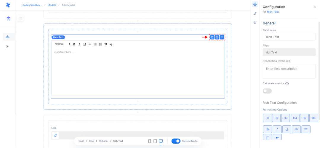
Rich Text Field and Configuration Tab.
Customize Rich Text Field
The General tab in the rich text field settings allows users to configure the basic field information and enable the calculation of metrics for the field. In this tab, users can also specify which formatting options will be available to editors when editing an entry.
In the Appearance tab, you can add help text with more details on how to use this field. Additionally, you can check a box to show the character count in the entry editor.
The Validations tab provides options for setting the field as required and limiting the character count within the field. Users can choose from the following options to specify the character count limits: "between" (two numbers), "at least" (a number), or "no more than" (a number). This allows users to ensure that the content within the rich text field meets their desired criteria and adheres to any necessary limitations.
JSON Object
The Json Object field allows users to add JSON data to their entries. This can be useful for storing complex data structures, or for integrating with external systems that use JSON as their primary data format. As with other field types, the Json Object field has a set of quick actions that allow users to delete the field, access the configuration tab, and rearrange the field's position within the model.
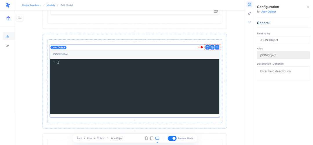
JSON Object Field and Configuration Tab.
Customize JSON Object
In the General tab, you can modify the field details for the JSON Object. In the Appearance tab, you can add a help text that will be displayed to editors. In the Validations tab, you can specify that the field is required and also set limits on the number of properties within the JSON Object. These limits can be defined using the "between" option (two numbers), the "at least" option (a single number), or the "no more than" option (a single number).
Boolean Field
The Boolean field is a simple field type that allows users to add a "true" or "false" value to their entries. This can be useful for representing binary or dichotomous data, such as indicating the premium status of a blog article on a website. When a Boolean field is selected, there are a few quick actions available, such as the ability to delete the field, access the configuration tab, and rearrange the field's position within the model.
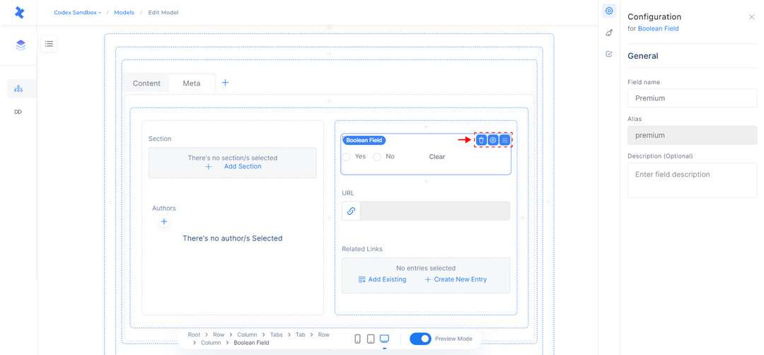
Boolean Field and Configuration Tab.
Customize Boolean Field
On the right Side Panel, the configuration tab provides access to the settings and options that are specific to the selected field type. This includes the ability to modify the General field details, as well as any additional functionality that is relevant to the field.
In the Appearance tab, users can customize the way in which the Boolean field is displayed within the entry editor. They can choose from options such as Radio, Checkbox, or Toggle Switch, and specify a default value of "True" or "False" for each option. This provides editors with a starting point for their entries.
In the Validations tab, you have the option to specify whether the Boolean field is required. If the Required field option is selected, editors will be required to fill in the field when creating entries. This ensures that all entries include the appropriate data in the Boolean field.
Location Field
The Location field allows you to add a Google Map to the model, providing a convenient way for editors to search for and add location addresses to their entries. When a Location field is selected, there are a few quick actions available, such as the ability to delete the field, access the configuration tab, and rearrange the field's position within the model.
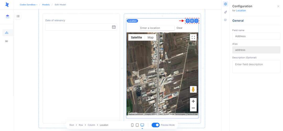
Location Field and Configuration Tab.
Customize Location Field
The Location field can be configured on the right Side Panel, using the same settings and options as other field types. This includes the ability to modify the General field details, add a help text to provide guidance for editors, and require the field to be filled out in order for the entry to be saved.
Text Field
The Text field is used to store text-based data. This field can be used for a variety of purposes, such as adding a title to a blog article on your site or creating a dropdown menu. When adding a Text field, you must specify the display format, which can be a single value or a list. By selecting the field, you can access several options, including the ability to delete the field, open the configuration tab, and change the field's position within the model.
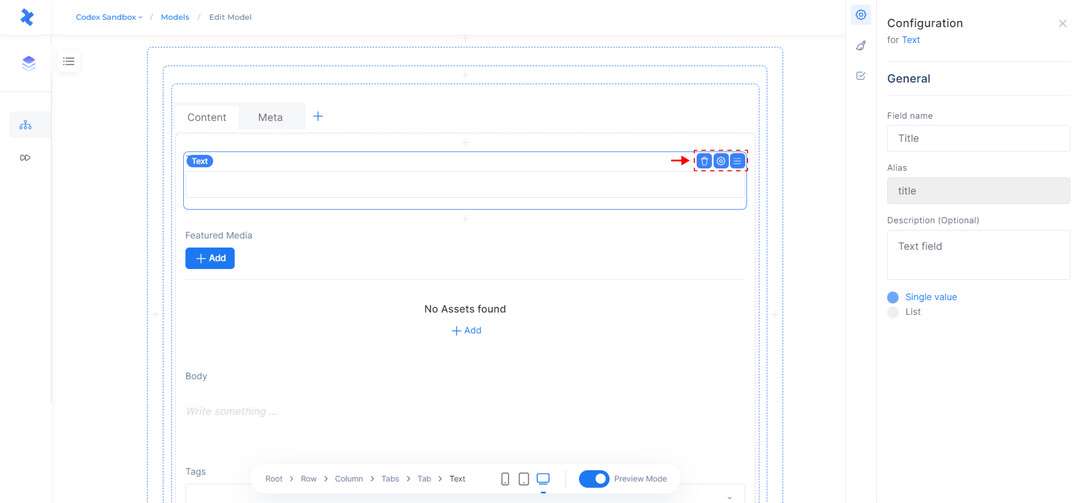
Text Field and Configuration Tab.
Customize Text Field
To add a text field, you will need to provide General information about the field, as well as specify its display type. The display type can be a single value or a list.
"Single value" allows for the addition of a single piece of text, such as a title or short description.
"List" allows for the creation of a list of text items, such as a list of keywords or tags.
Depending on the display settings of the text field in the Appearance tab, you can choose from a range of options for how the field will appear in the entry editor. These options include single line, multiple lines, URL, dropdown, radio, slug, tag, list, and checkbox.
"Single line" allows for text to be added in a single line only.
"Multiple lines" allows for text to be added in multiple lines.
"URL" enables the addition of URLs or links to the field.
"Dropdown" and radio provide a list of predefined choices from which the editor can select a single value or item.
"Slug" allows the creation of a simplified version of a word or phrase to be used as part of a URL.
"Tag" provides a list of predefined options that can be marked by the editor based on the content.
"List" enables the insertion of comma-separated values.
"Checkbox" allows the selection of predefined options depending on the purpose.
In the Appearance tab, you can also add a default value for the field and a help text to provide more information about using the field. Additionally, you can check a box to show the character count in the entry editor.
In the Validations tab, in addition to the required and unique field options, you can also limit the character count for the text field by choosing from the following options:
"At least" allows the editor to add a minimum number of characters to the text field.
"At most" enables a maximum number of characters to be added.
"Exactly" allows for the addition of a specific number of characters.
Reference Field
The Reference field is used for creating relationships between different content types in your model. It allows editors to add or link other entries within an entry, avoiding the need to duplicate or re-enter content manually. When a Reference field is selected, there are a few quick actions available, such as the ability to delete the field, access the configuration tab, and rearrange the field's position within the model.
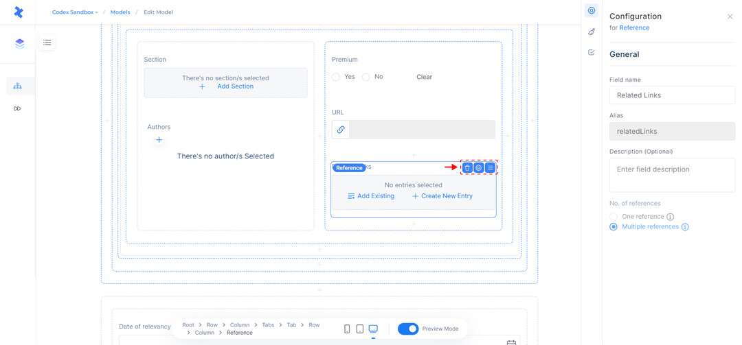
Reference Field and Configuration Tab.
Customize Reference Field
When adding a Reference field, you need to provide the necessary General field information as well as specify the number of references that can be added or linked within the entry. This can be either a single reference or multiple references.
In addition, the Appearance options for the Reference field allow you to display the references in either a list or grid view, if you have selected the option for multiple references. Additionally, editors can include helpful text to guide users when working with this field. Moreover, it is possible to disable the Create button, which prevents editors from creating new entries directly from the Reference Field.
In the Validations tab, you have several options for adding constraints to the Reference Field, such as:
The Required field option, which requires the field to be filled out before the entry can be published.
The Accept only specified entry type option, which allows you to select the models from which editors can add entries. This ensures that editors can only add entries from the specified models.
The Allow duplicates option, which allows editors to add the same entry multiple times.
The Accept only a specified number of entries option, which allows you to set a limit on the number of entries that can be added to the field.
Date and Time Field
The Date and Time field allows users to add a date and time to their entries. This can be useful for representing events or schedules, such as indicating the publication date of a blog article on a website. When a Date and Time field is selected, there are a few quick actions available, such as the ability to delete the field, access the configuration tab, and rearrange the field's position within the model.
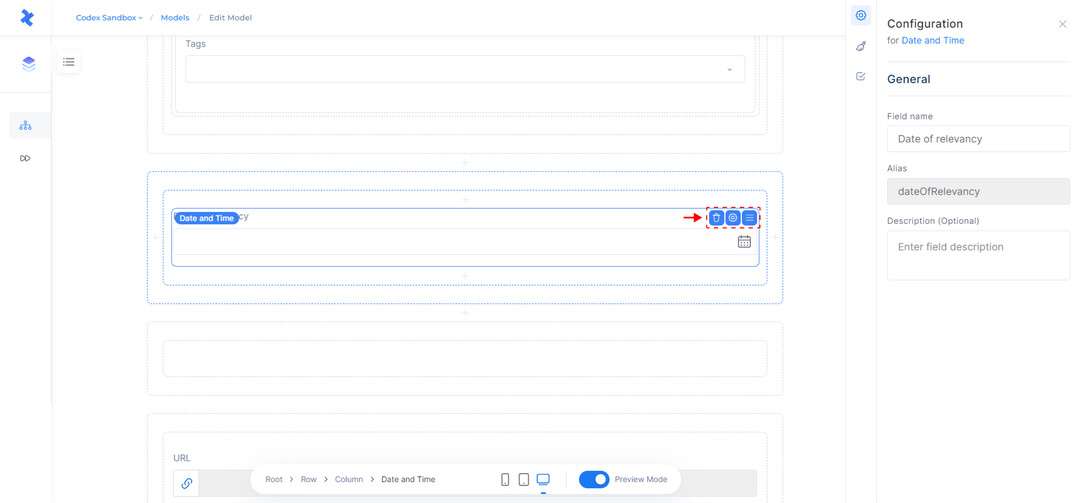
Date and Time Field, and Configuration Tab.
Customize Date and Time Field
To access the settings and options specific to the Date and Time field, you can use the configuration tab located on the right Side Panel. This tab allows you to modify the General field details and any additional functionality that is relevant to the field.
In the Appearance tab, users must specify the format of the Date and Time Field, which can be either Date only or Date and Time. Users can also customize the default value that is displayed to editors, and specify a help text to provide guidance on using the field.
In the Validations tab, users can select the Required field option to ensure that the field is filled out in order for the entry to be saved, and can also set a date and time range to limit the values that can be entered into the field.
Rich Content Field
The Rich Content field is the main field for creating dynamic, rich content within entries. It is a field that consists of blocks of values or types, some of which are similar to other field types described earlier, but with additional specialized functionality. For example, the Media Field can be added as a standalone field, or as a block within the Rich Content field. Using the Rich Content field, editors can create the body of a blog article, adding different blocks to suit their content, such as Heading, Paragraph, Bullet or Ordered List, Factbox, Blockquote, Embeds, Media, References, and many others. When a Rich Content field is selected, there are a few quick actions available, such as the ability to delete the field, access the configuration tab, and rearrange the field's position within the model.
We recommend adding the Rich Content field on a full width column.
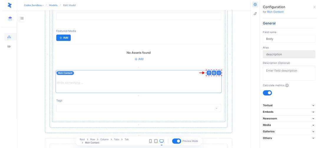
Rich Content Field and Configuration Tab.
For more information on working with Rich Content Fields and their content types, click here.
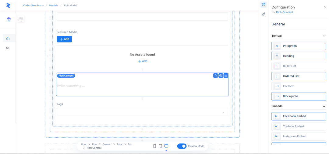
Customize Rich Content Field
To customize which blocks can be added to the Rich Content field, use the General tab on the right Side Panel. This tab groups the available blocks into categories such as Textual, Embeds, Newsroom, Media, and Other. Simply deselect any blocks that you do not want your editors to use in their entries.
In the Appearance tab, you can add help text to provide more information to your editors on how to use this field efficiently. Additionally, you can check a box to show the character count in the entry editor. This can aid in making sure that your editors are able to effectively utilize the rich content field and create high-quality content for your site.
Rich Content Field and Configuration Tab.
Authors Field
The Authors field allows editors to add the names of the authors who created or edited the content of an entry. This field can be displayed as either a single author or multiple authors, depending on your preference. When adding the Authors field to the model editor, you can use the quick actions to delete the field, open the configuration tab to customize its settings, and rearrange its position within the model.
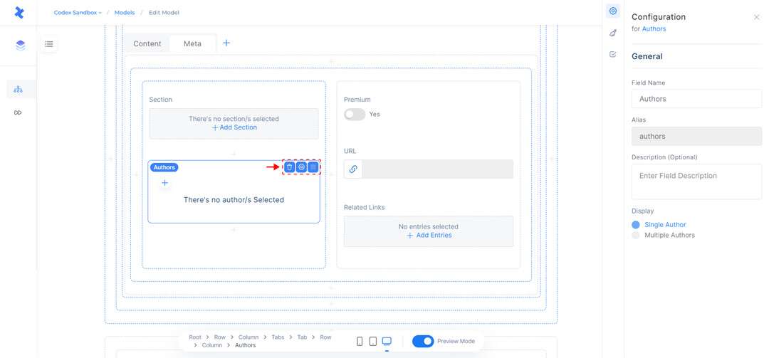
Authors Field and Configuration Tab.
Customize Authors Field
The Configuration tab allows you to customize the General field information, and the Appearance tab where you can add help text to guide editors on how to use the field.
In the Validations tab, you can mark the field as required. If the Authors field is set to allow multiple authors, you can also use the Configuration tab to set a limit on the number of authors that can be added to an entry. This helps ensure the integrity and consistency of the data within the system.
Tags Field
The Tags field is used to add relevant keywords to the content of a site. This field is useful for SEO and can help search engines rank the site based on its content. It also makes it easier for users to find specific content on the site. For example, editors can use the Tags field to add keywords to a blog article. When adding the Tags field to the model editor, you can use the quick actions to delete the field, open the configuration tab, and change its position within the model.
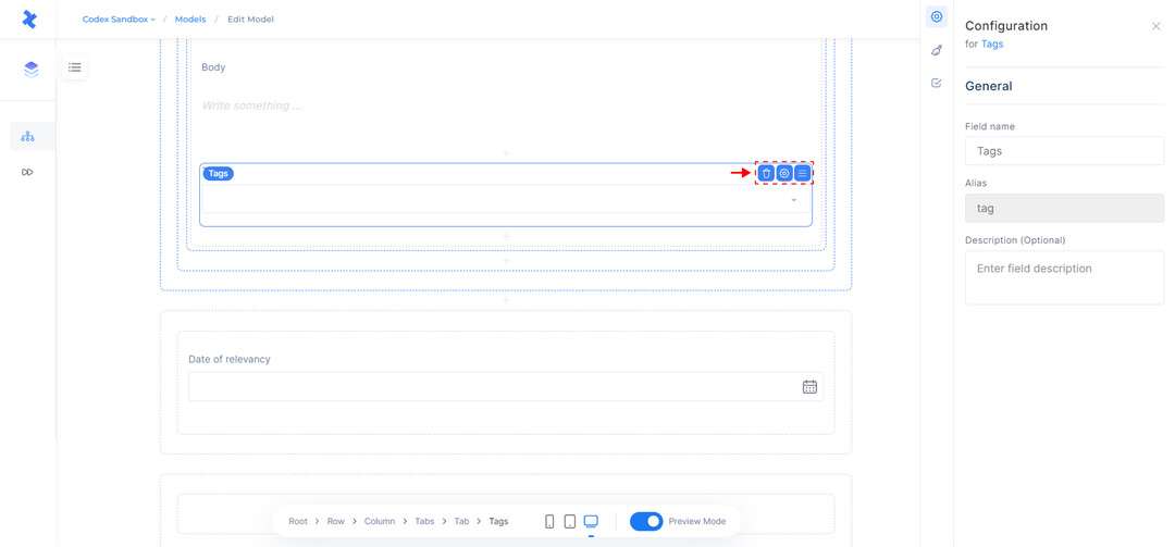
Tags Field and Configuration Tab.
Customize Tags Field
The Tags field can be configured in the right Side Panel, which includes details and functionalities similar to other fields. By using the configuration tab, you can change the General field details and choose how the tags can be generated by editors. The available options are:
Free text, which allows any tag to be added in the Tag field.
Suggested tags, which restricts the suggested tags to recommended tags from third-party tools that have been integrated.
In the Appearance tab, you can add help text that will be shown to editors on how to use this field. In the Validations tab, you can predefine it as a required field and specify the number of tags in the field.
Sections Field
The Sections Field enables editors to add sections of your site to an entry. When adding the field to the model editor, you can select whether to display it as a single section or multiple sections from the options on the right Side Panel. Once the field has been added, you can use the available quick actions to delete the field, open the Configuration tab, and adjust its position within the model.
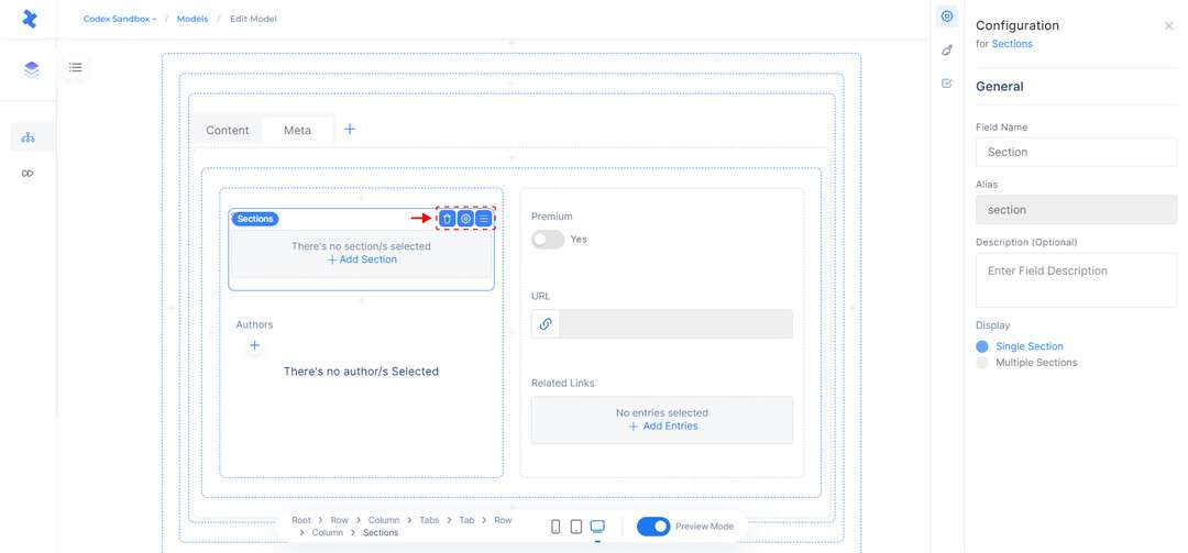
Sections Field and Configuration Tab.
Customize Sections Field
In addition to the General field details which allow you to change the field's information, and the Appearance tab which allow you to add help text, respectively, the right Side Panel also includes the Validations tab. From this tab, you can define the sections field as a required field, which will ensure that editors must add a section to the entry. If the field is set to display multiple sections, you can also set a limit on the number of sections that editors can add to the entry. Moreover, you have the option to specify the Entry Status on which the section can be modified in the Entry Editor.
URL Field
The URL field refers to a field in an entry editor that allows editors to specify the URL for the associated content. The field may be configured to use specific entry fields to automatically generate the URL, and may have additional options in the Configuration Tab to customize its behavior. By clicking on the URL field, there are a few quick actions available which allow you to delete the entire field, open the configuration tab, and change the field position inside the model.
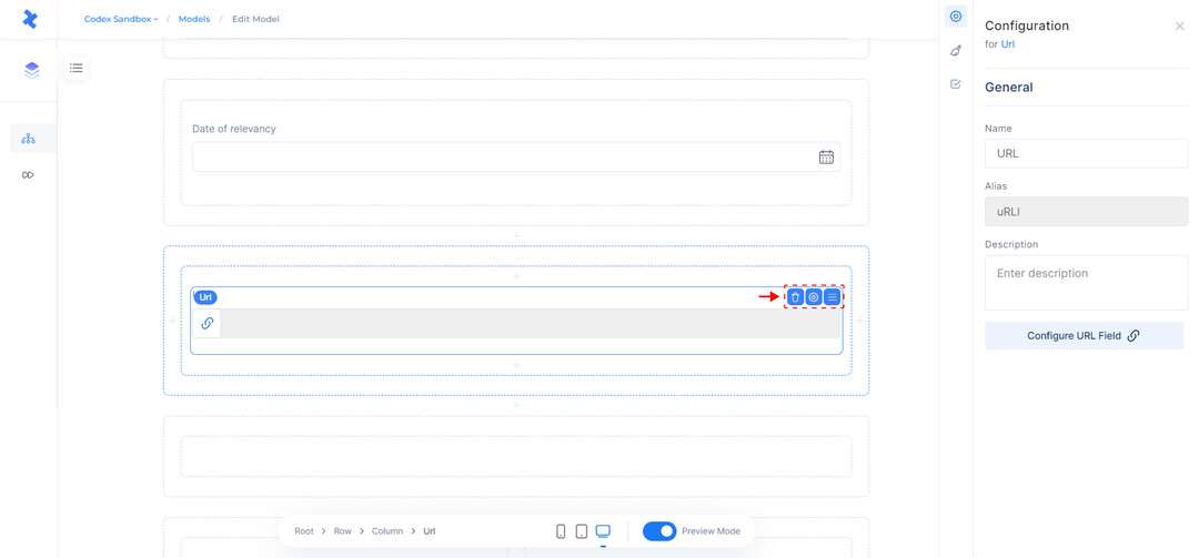
URL Field and Configuration Tab.
Customize URL Field
In the General tab, in addition to the field information, you have the option to configure the URL field by using entry fields. This allows you to specify which field or fields within the entry should be used to create the URL.
How to configure URL
Configure the URL pattern by using entry fields. Available fields that can be added as part of URL segments are: Text Field(single value), Number Field(single value), Date&Time Field(single value), Author Field & Section Field (You can use only the ID value of section or author field). The parameters will be automatically replaced with the corresponding values in the Entry Editor. Put the entry parameters into curly braces, e.g {content.field_alias}
Use these built-in methods in the URL Fields to get the transform specific field value types:
Text Field: {slugify(field_alias)}
Date&Time Field: {getDate(fieldalias)}, {getMonth(fieldalias)}, {getYear(field_alias)}
Section Field (single): {field_alias.id}
Section Field (list): {getMain(field_alias).id}
Author Field (single): {fieldalias.id},{fieldalias.url}
Author Field (list): {getFirst(fieldalias).id},{getFirst(fieldalias).url}
In the Appearance tab, you have the option to add help text to provide additional information and guidance to editors on how to use the field. This can be useful for explaining the purpose of the field, or providing instructions on how to enter valid values.
In the Validations tab, you can specify which entry status the URL can be updated in the entry editor. The available statuses include Draft, Published, Scheduled, Unpublished, and Edited. This allows you to control when and how the URL can be modified, and can help ensure that the URLs for your content remain consistent and accurate.
Container Field
The Container field is a general field in Codex that allows you to create a grid system within a model. It is typically used to hold other elements, such as rows and columns, and other fields to create the structure of the model.
When clicking on the Container field, you can use the quick actions to delete the field, open the configuration tab, and change its position within the model. The configuration tab, located on the right Side Panel, also allows you to define the type of container by selecting from the options in the drop-down menu, which include Div, Header, Main, Section, and Footer.
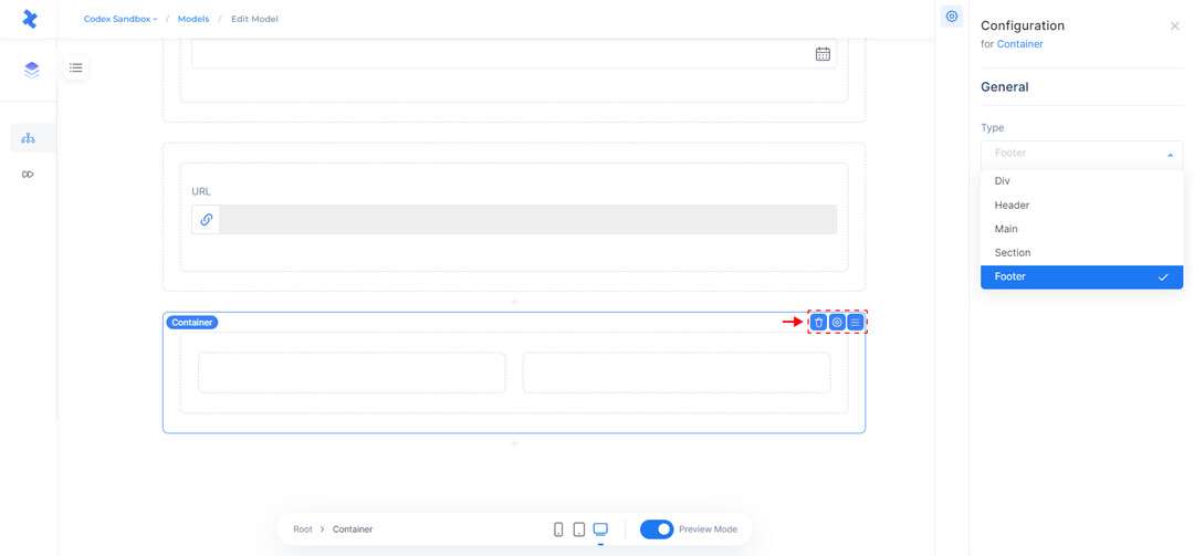
Container Field and Configuration Tab.
Row Field
The Row field is a general field in Codex that allows you to create a horizontal layout within the model editor. It is an essential element in the grid system for holding columns.
When clicking on the Row field, you can use the quick actions to delete the field, open the configuration tab, and change its position within the model. The configuration tab, located on the right Side Panel, also allows you to view the size of the columns within the row for different device types, such as Desktop, Tablet, and Mobile.
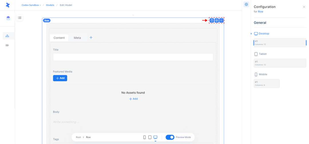
Row Field and Configuration Tab.
Tabs Field
Tabs are a useful way to divide content into meaningful sub-sections and avoid the need for multiple pages on a similar topic. For example, you can use tabs to divide the content of a blog article into two sections named "Content" and "Meta." Each tab can contain specific fields that are required for different purposes.
When clicking on a tab name, you can use the quick actions to rename the tabs and reorder them as needed. There are also quick actions for the field that allow you to delete the entire field and change its position within the model.
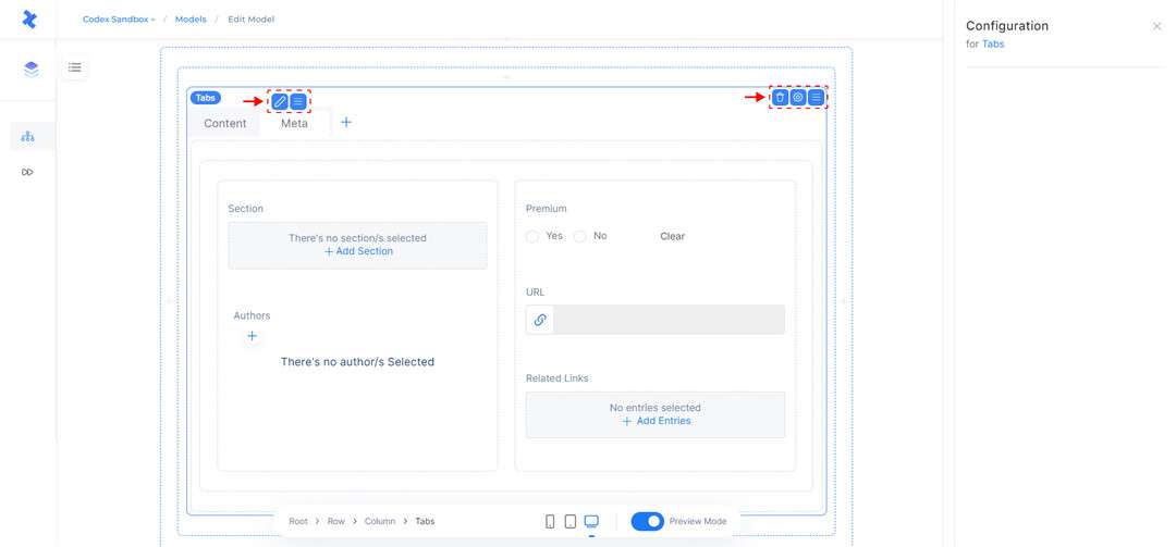
Tabs Field inside the Model Editor.